Equity Property Management Limited was developing a new suite of brand-specific illustrations to complement its refreshed corporate identity and strengthen its visual presence across all communication platforms. This builds on their updated logo, typography, and color system, extending the brand into a distinctive graphic style that feels modern, and unmistakably Equity.
The illustration direction draws inspiration from the character of Chittagong and the broader story of real estate in Bangladesh—capturing elements such as the port, lakes, sea, changing seasons, bustling streets, construction activity, and everyday urban life. Designed as a flexible visual layer, the artwork will serve as a backdrop for billboards, hoarding signage, social media content, cover photos, and a variety of promotional materials.
Info
-
ClientRevel Creatives
-
Year2024
-
RoleArt Direction / Visual
-
Website
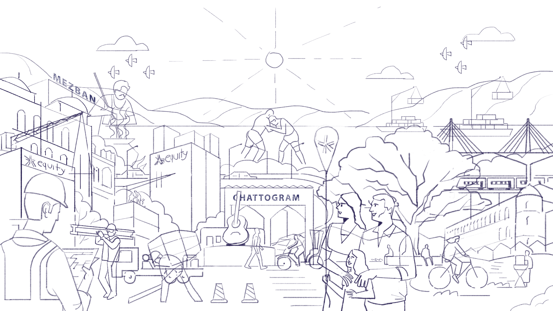
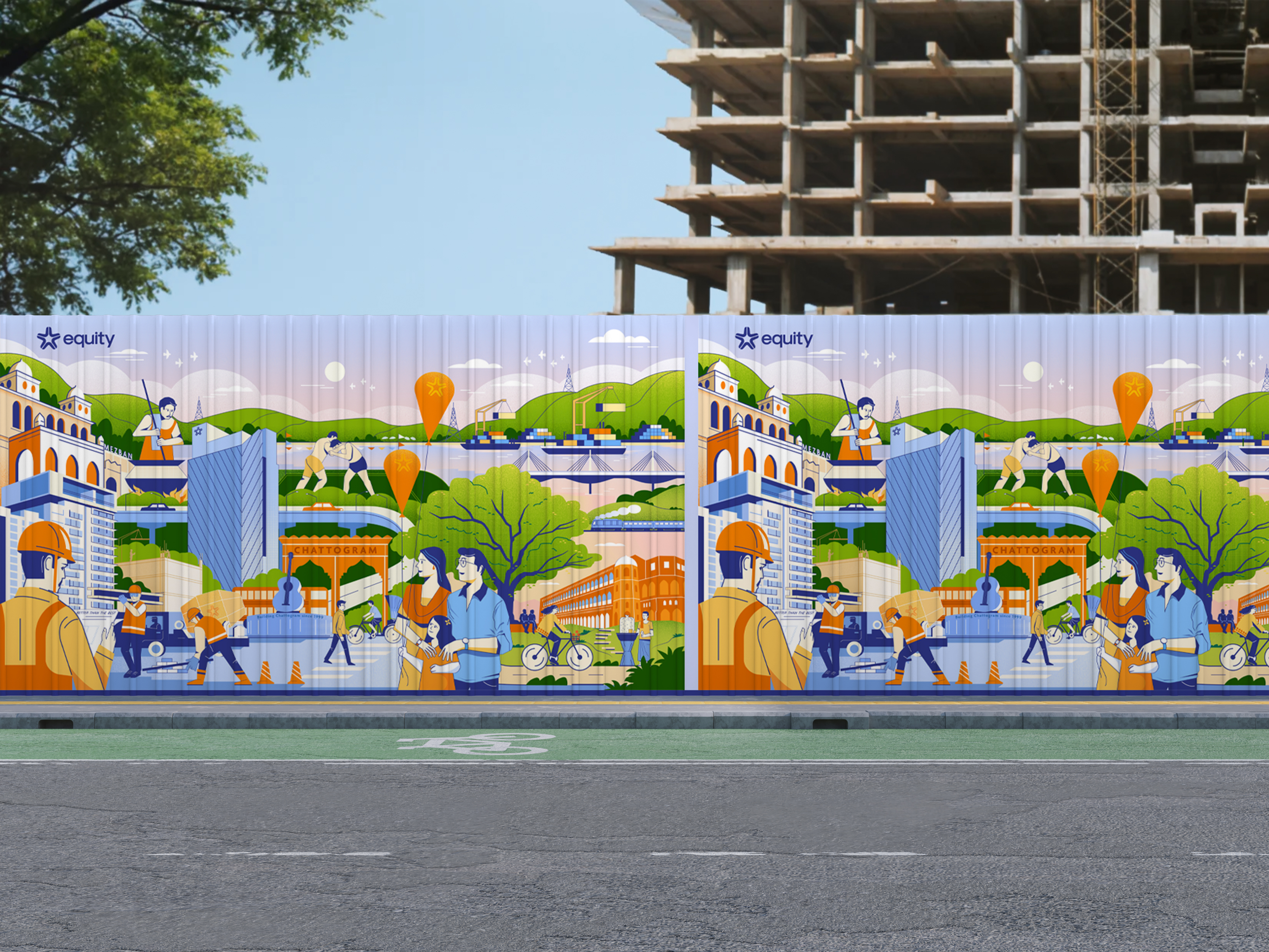
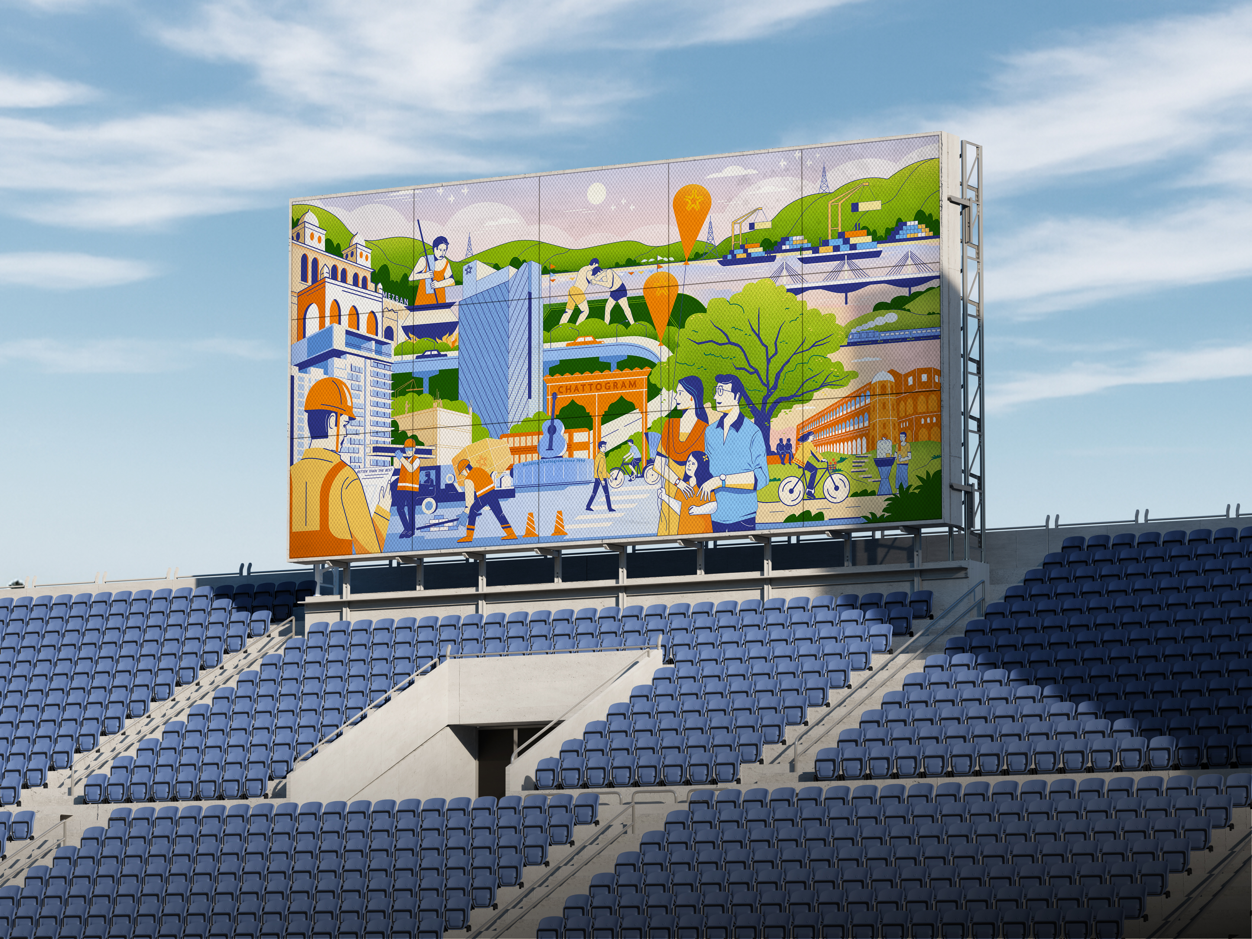
The Vision
Position Equity Property Management as a forward-thinking, deeply rooted company with a visual identity that is vibrant, relatable, and instantly recognizable. The illustrations will unify brand touchpoints and offer a dynamic way to communicate Equity’s heritage, values, and connection to the communities it serves.